

29 September 2026 edition | Delhi, India
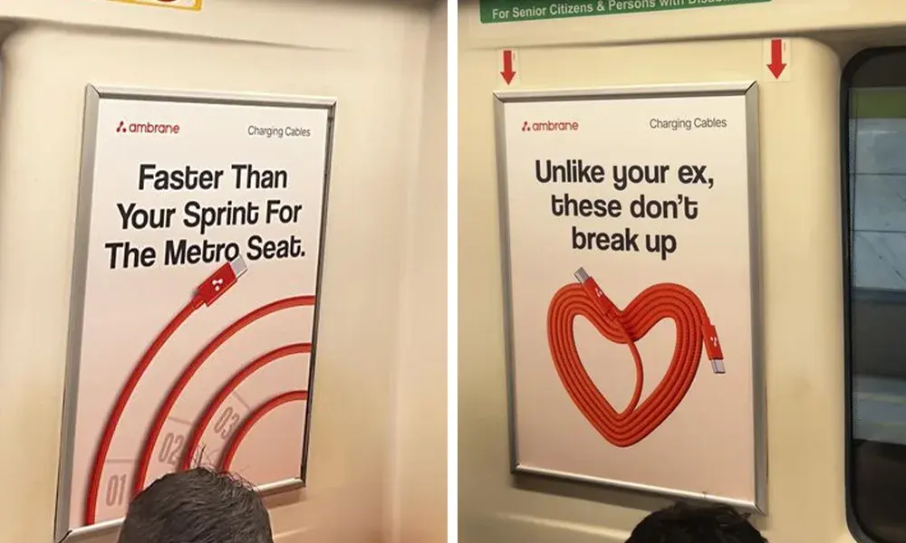
Ambrane’s charging cable campaign uses the commuter environment to give a functional accessory a more conversational identity. Media4Growth’s 29 September coverage describes creative inside metro coaches, with a red cable linking the executions visually.
Earlier coverage published on 24 September by Brand to Watch places the work in Delhi Metro. The campaign was therefore already being reported before this edition date.
Everyday references carry the product message
The executions connect cable benefits with familiar situations such as the working day, relationships and the rush for a metro seat. The product remains visible while the copy supplies the joke.
The available accounts describe the creative approach, rather than audited delivery or commercial results. They do not establish that the humour improved recall or increased purchases.
Context can make the copy more specific
BillboardGuide’s analysis: A transit environment gives an advertiser shared experiences to draw on. A reference to finding a seat has a clear relationship with the place where the message appears. That can provide a more specific starting point than a generic product slogan.
The creative discipline is to keep the benefit connected to the humour. If viewers remember a joke but cannot identify the product or brand, the execution may have missed its commercial purpose. A useful review would ask someone unfamiliar with the campaign to explain what is being advertised after a brief look.
For a similar accessory campaign, the brand could select one benefit per execution and retain a consistent visual device across the series. Each poster should work independently, because an individual commuter may encounter only part of the campaign.
In-train media needs its own artwork review
BillboardGuide’s outdoor format guides provide a starting point for comparing media environments. Inside a carriage, artwork needs to be reviewed against the actual panel dimensions, sightlines and obstructions rather than adapted mechanically from another format.
Text hierarchy remains important even where the audience may have more time to look. The product, brand and main message should be easy to identify before a viewer chooses whether to read further. Humour should also be checked for clarity in the intended language and audience context.
The creative checklist can support a final review of typography, contrast and branding. Product performance references should be cleared against the advertiser’s evidence before files are approved.
Connect the creative to a defined campaign objective
For an advertiser using a comparable approach, the brief should decide whether the campaign aims to introduce a product, establish brand familiarity or support an existing retail offer. Those objectives can require different calls to action and evaluation methods.
BillboardGuide’s earlier OPPO Select City Walk article offers another Delhi reference for advertising in a physical venue. It concerns a different environment and buying approach, providing a comparison for how location can shape a brief.
Ambrane’s work is a useful creative example of turning the surroundings into material for the message. The next question for a buyer is how to test that message and evaluate its contribution to the chosen objective.
 Amsterdam